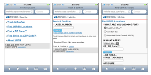
USPS Mobile -or- 5 Things I Hate About m.usps.com

Last week the USPS announced that they are offering a mobile-optimized version of the most popular functions from the usps.com website. While some will appreciate this addition, the implementation of the iPhone specific version is a bit disappointing.
1. No good looking icon for my iPhone home screen! – when you add the web page to your home iPhone, it’s displayed with a generic icon, making it hard to locate amidst all my apps and links. It doesn’t take much effort to create a 57×57 icon named apple-touch-icon.png.
2. No way home! There is always link home at the bottom of the page, but I have to scroll. Make the header image link home please.
3. Bad Form Validation. If I error in form input, it has to reload a page, which is really annoying on a mobile device. Simple client side JavaScript can have been utilized to check for form requirements/errors quickly.
4. Not optimized for the iPhone! There are tons of templates out there, and it’s not hard to create your own. iui or another framework could have been utilized to provide a iPhone-like appearance. At least the address bar could be hidden to provide more screen real estate.
5. The locator function could utilize Geographic Location Classes.